

If you design a website on a 27-inch desktop monitor and treat the mobile layout as an afterthought, your digital strategy is already obsolete. In 2026, mobile devices account for approximately 59.6% to 64% of all global internet traffic. In rapidly growing digital economies like India, that number skyrockets to an astonishing 76% to over 80%.
Today, mobile-first web design is not just a UI/UX trend; it is a foundational pillar of technical SEO, user engagement, and revenue generation.
Summary:
- Traffic Dominance: Mobile drives roughly 60-64% of global web traffic, making it the primary medium for brand discovery.
- Google’s Rule: Google operates strictly on mobile-first indexing, meaning it ranks your site based exclusively on its mobile version.
- Content Parity: If content exists on your desktop site but is hidden on mobile, Google will ignore it.
- Performance Gap: Only about 39% to 48% of websites pass all three Core Web Vitals on mobile, presenting a massive competitive opportunity for optimized sites.
What is Mobile-First Web Design?
Mobile-first web design is an architectural approach where web developers and designers conceptualize, prototype, and build the user interface (UI) for the smallest smartphone screens first. Once the mobile experience is perfected, the design is progressively enhanced and scaled up for tablets and desktop monitors using responsive CSS techniques.
1. The Data Behind the Shift: Mobile Traffic in 2026

The shift toward mobile has been a steady march since 2011, when mobile traffic sat at a mere 6.1%. By late 2016, mobile surpassed desktop usage globally. Now, in 2026, we are approaching a state of saturation in many markets, but the behavioral reliance on mobile devices has deepened significantly.
The distribution of this traffic, however, is not uniform across all sectors:
- Consumer-Facing & Local: For local businesses (restaurants, services) and retail, mobile traffic often dominates at 70% to 85%. Users are searching with immediate, local intent.
- Ecommerce: While browsing heavily skews mobile, a significant portion of purchasing still occurs on desktop. The goal here is frictionless transition and reducing mobile cart abandonment.
- B2B & Professional Services: This is one of the few sectors where desktop retains a strong presence (often hovering around 45% to 60% desktop share), but mobile optimization remains critical for initial brand discovery and credibility.
2. Google’s Mobile-First Indexing: The 2026 Reality

To understand why responsive website development is non-negotiable, you must understand how search engines evaluate your code.
Mobile-first indexing means that Google’s crawlers behave exactly like mobile smartphone users. Google uses the mobile version of your website for crawling, indexing, and determining search rankings.
The “Content Parity” Trap
Historically, developers would hide heavy text, large images, or complex navigation menus on mobile devices to save space on smaller screens. In 2026, this is a fatal SEO error. Content parity matters.
If crucial information, structured data (schema markup), or internal links are present on your desktop site but are hidden or removed on your mobile version, Google assumes they do not exist at all. This lack of parity will result in severe ranking drops for those omitted terms. You must design your mobile layout to gracefully house all necessary content without resorting to hiding it.
3. The Mobile Performance Gap: Core Web Vitals Benchmarks 2026
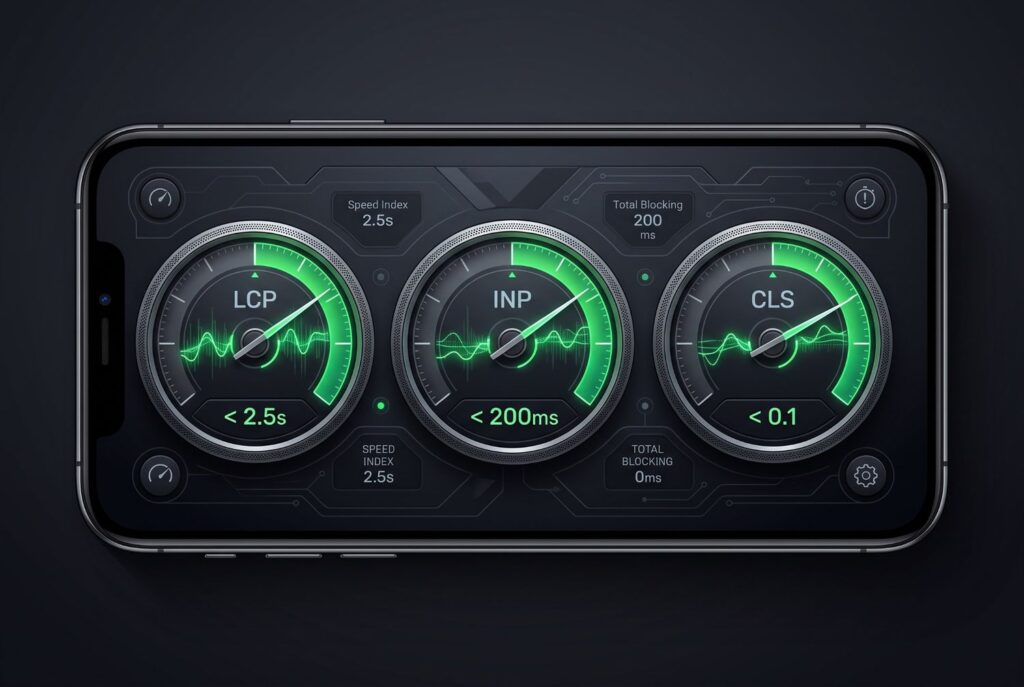
A responsive layout is utterly useless if the site takes ten seconds to load on a 4G or 5G cellular connection. Google utilizes Core Web Vitals as a strict ranking signal, and the mobile benchmarks are notoriously difficult to pass.
Currently, only around 39% of websites pass all three mobile Core Web Vitals, compared to 54% on desktop. This disparity represents a massive opportunity for technical SEOs and developers. Google evaluates these metrics at the 75th percentile of real-world user data (via the Chrome User Experience Report), meaning you must optimize for your slower users, not just the median.
To dominate mobile SEO best practices, your development team must hit these strict 2026 thresholds:
- Largest Contentful Paint (LCP) – Loading Speed: The time it takes for the largest visible element (usually a hero image or H1 tag) to load.
- 2026 Benchmark: Must occur within 2.5 seconds.
- Optimization: Use next-gen image formats (WebP/AVIF), implement explicit preload hints for hero assets, and avoid lazy-loading critical above-the-fold content.
- Interaction to Next Paint (INP) – Responsiveness: This metric, which replaced First Input Delay (FID) in 2024, measures the latency of all user interactions across the page lifecycle, not just the first one.
- 2026 Benchmark: Must be under 200 milliseconds.
- Optimization: You must defer non-essential, heavy JavaScript that blocks the browser’s main thread (e.g., third-party review widgets, chat scripts). When a user taps a menu or an “Add to Cart” button, the UI must respond instantly.
- Cumulative Layout Shift (CLS) – Visual Stability: Measures how much the page layout unexpectedly shifts while loading.
- 2026 Benchmark: Must remain under 0.1.
- Optimization: Ensure all mobile ads, images, and banners have hardcoded CSS width and height attributes. Pre-load web fonts to prevent text reflow, ensuring the page doesn’t “jump” while the user is reading or trying to click.
4. Technical Implementation: Building for the Mobile-First Era

How do you actually execute responsive website development at an elite level? It requires a combination of smart CSS, technical discipline, and behavioral psychology.
A. Fluid Grids and Relative Units
Responsive design relies heavily on flexible grid systems (like CSS Grid and Flexbox). Instead of using fixed pixel widths (e.g., width: 800px), developers must use relative units like percentages (%), viewport width (vw), viewport height (vh), and rem for typography. This foundational approach ensures the site layout stretches, contracts, and reflows perfectly whether the user is on an iPhone 16, a folding Android device, or a 4K monitor.
B. Touch-Friendly UI Engineering
Mobile users do not have the pixel-perfect precision of a mouse cursor; they navigate with thumbs and fingers.
- Target Size: Google recommends that all buttons and clickable links have a minimum target size of 44px by 44pxor 48px by 48px.
- Spacing: Ensure adequate padding (white space) between interactive elements to prevent frustrating “accidental taps” or “fat-finger” errors, which can quickly inflate bounce rates.
C. Streamlined Forms and Data Entry
Typing on a virtual mobile keyboard is tedious and error-prone. If you are building an ecommerce checkout or a critical lead generation form, you must leverage HTML5 autofill attributes (e.g., autocomplete="shipping address-line1").
Furthermore, integrating express payment options like Apple Pay or Google Pay can dramatically reduce mobile friction. For a deep dive into how mobile UX impacts online revenue and checkout abandonment, read our companion guide: Ecommerce Website Development: Conversion Rate Analysis and Architecture Best Practices.
5. The Regional Imperative: India and the “Mobile-Only” Market
For businesses operating in or targeting rapidly developing regions like India, parts of Africa, and Southeast Asia, the concept of “mobile-first” is essentially synonymous with “mobile-only.”
In India, mobile devices command an overwhelming majority—often cited between 76% to over 80%—of the total web traffic share. Many users in these demographics skip desktop ownership entirely, experiencing the internet solely through affordable smartphones on varied cellular networks.
If you are budgeting for a web project in these regions , allocating the vast majority of your UI/UX design, QA testing, and performance optimization budget directly to the mobile interface is a strategic necessity, not an option. A slow, unresponsive mobile site in a market with 80% mobile penetration is effectively a broken business.
Frequently Asked Questions (FAQ)
Does having a separate mobile site (m.example.com) work for SEO in 2026?
No. Google strongly advises against using separate, dedicated mobile URLs (m-dot sites). Best practices dictate using a single, unified URL with responsive website development principles, where one single codebase fluidly adapts to all device sizes. This prevents duplicate content issues and consolidates link equity.
Why did my website’s ranking drop when Google switched to mobile-first indexing?
If your ranking dropped, you likely suffered from a lack of content parity. Your desktop site probably contained valuable text, structured data markup, or essential internal links that were hidden or removed on the mobile version to save screen space. Google only ranks what it sees on the mobile version.
How can I effectively test my mobile-first web design?
Do not rely solely on shrinking your desktop browser window. Use Google’s PageSpeed Insights and Chrome Lighthouse to test against Core Web Vitals thresholds. More importantly, use the Mobile Usability report within Google Search Console to monitor real-world user data and identify clickable elements that are too close together or content that overflows the viewport.
Ready to Upgrade Your Mobile Architecture?
If your website is failing Google’s mobile Core Web Vitals or suffering from high mobile bounce rates, you are actively losing traffic and revenue to faster, more responsive competitors. In 2026, mobile-first web design is the only sustainable path forward.
Contact Us Today and connect with our senior developers and discover exactly what is holding your mobile conversion rates back.
