
Every business owner wants a website that brings in revenue. Brands track metrics, run expensive A/B tests, and spend hours debating whether a checkout button should be navy blue or crimson. Yet, if you strip away the subjective design trends, web conversion isn’t a dark art or a guessing game. It is a structured exercise in human psychology and behavioral design.
To build a digital storefront that consistently turns casual traffic into paying customers, you must understand the fundamental friction between two competing philosophies: Conversion-Rate Optimized (CRO) design and “Aesthetic-First” design.
Here is the deep behavioral framework that separates high converting websites from those that just look pretty.
1. The Core Forces of Conversion Psychology
When a user lands on a page, a silent tug-of-war happens in their subconscious. They don’t think about “user experience”—they react to visual inputs. Every landing page acts as a balancing act between four main psychological forces:
- User Motivation: How badly does the visitor want a solution to their specific problem when they arrive? If they are looking for emergency plumbing, their motivation is sky-high. If they casually clicked an ad from social media, it is remarkably low.
- Clarity of Value: Can the user understand exactly what you offer and why they should choose you over a competitor within the first 3 seconds? If your headline is vague, their brain switches off.
- Friction: How difficult is it to complete the desired action? Friction comes in many forms: excessive form fields, slow page load times, hidden pricing, or confusing menu bars.
- Anxiety: What doubts does the user have about trust and safety? They are silently asking: Is this site secure? Will they steal my data? Is this a scam? Will their customer support disappear if things go wrong?
High converting websites succeed because they intentionally amplify motivation and clarity while ruthlessly eliminating friction and anxiety.
2. Converting Sites vs. “Pretty” Sites: The Structural Breakdown
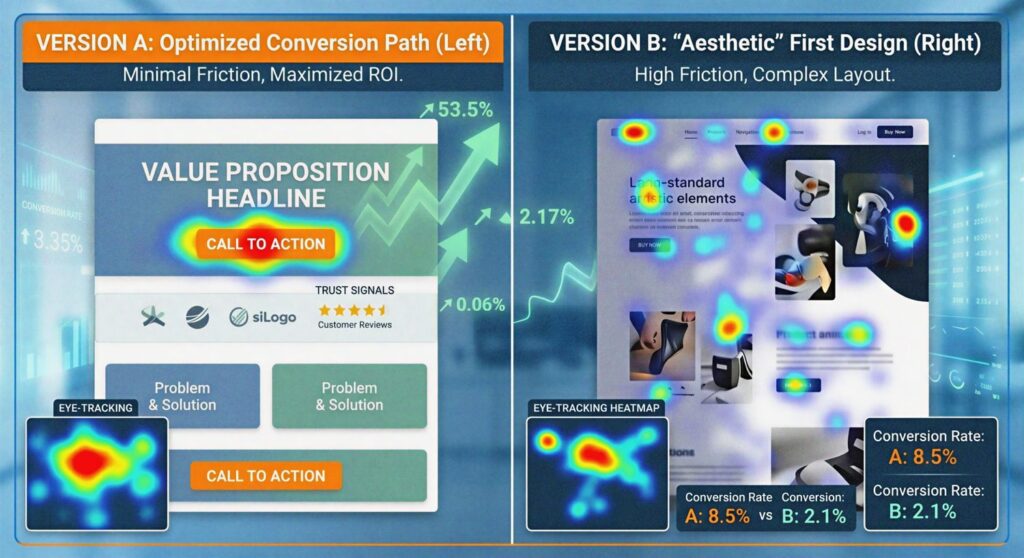
Why do beautifully designed, award-winning websites often fail to make sales? Because they optimize for design community validation instead of actual human behavior. They prioritize artistic asymmetry, complex motion graphics, and ultra-minimalist text over basic usability.
The diagram below illustrates the foundational elements that control how a web visitor processes information visually. Notice how factors like focal points, contrast, font hierarchy, and reading patterns dictate exactly where the user looks first.
To see how these philosophies differ in practice, consider the design choices below:
| Design Element | High Converting Websites | Low-Converting “Aesthetic” Websites |
|---|---|---|
| Visual Hierarchy | Critical elements (like the checkout button) use high-contrast colors and large fonts that are impossible to miss. | Crucial buttons blend entirely into the background color palette to maintain a “clean, uniform look.” |
| Cognitive Load | Low. Follows familiar web layouts (e.g., the shopping cart icon is always placed in the top right corner). | High. Forces users to figure out “creative,” hidden navigation menus or non-standard scrolling. |
| Copywriting | Benefit-driven, simple, punchy, and addresses user pain points immediately. | Vague, metaphorical, or packed with corporate jargon that sounds fancy but explains nothing. |
| Load Speed | Optimized strictly. Imagery is compressed and code is lean because fast-loading pages preserve user momentum. | Loaded with heavy, uncompressed 4K video backgrounds and complex animations that lag on mobile devices. |
3. Two Psychological Laws of Web Layouts
If you want to optimize your site’s layout for maximum sales without relying on pure guesswork, your design choices should align with how the human brain naturally processes choices and physical targets on a screen.
Target Acquisition (The Ease of Action)
The easier it is to physically interact with an element on a screen, the more likely a user is to do it. On desktop computers, this means large clickable areas. On mobile devices, it means your primary call-to-action buttons must be large, distinct, and positioned exactly where a user’s thumb naturally rests while holding a phone with one hand. If a user has to stretch their thumb to the top corner of the screen just to read more or buy, you are introducing physical friction.
Choice Overload (The Paradox of Choice)
The time it takes for a person to make a decision increases dramatically with the number and complexity of the choices presented to them. When people are overwhelmed with options, their default reaction is to make no decision at all and leave the page.
The Rule of One: Landing pages that fail to generate revenue almost always suffer from choice paralysis. If your landing page features five different offers, four separate email opt-ins, social media links, and a busy navigation header, visitors will leave out of sheer mental fatigue. High converting websites feature one primary action per page.
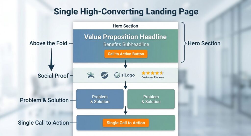
4. The Anatomy of a High-Converting Landing Page
To guide a user from a casual, skeptical visitor to a confident customer, high performing layouts typically follow a predictable, psychologically sound structural sequence from top to bottom:
1. Above the Fold (The Hook)
This is everything a user sees before they scroll down. It requires three critical pieces: a bold main headline explaining the core value proposition, a brief subheadline expanding on the main benefit, and one prominent call-to-action button. No background distractions, no lengthy fluff.
2. Social Proof (Anxiety Reduction)
Immediately beneath the primary hero section, you must ease user anxiety. High-converting layouts quickly display recognizable logos of trusted brands, media mentions, customer testimonials, or verified star ratings. This proves to the user’s subconscious that others have safely traveled this path before them.
3. The Problem and Solution Breakdown
Now that you have their attention and trust, you address their motivation. Clearly outline the exact pain point the user faces. Speak their language. Once the problem is established, introduce your product or service as the ultimate antidote, using bulleted features that highlight benefits rather than dry technical specifications.
4. The Single Call to Action (The Closer)
As the user finishes reading your benefits and reaches the bottom of the page, you must minimize the distance to the next step. Repeat your primary call-to-action button in a dedicated section. The moment they are fully convinced, the path forward should be sitting right in front of them.
Conclusion: Clarity Trumps Cleverness
Websites that convert exceptionally well aren’t necessarily plain or ugly, but their creators understand that clarity always beats cleverness. A successful digital presence treats design as an invisible vehicle for the user’s journey—removing obstacles, answering lingering doubts, and keeping the path forward completely obvious.
If your business website isn’t converting the way you want it to, stop asking your team “Is this pretty enough?” and start asking “Where are we confusing our user?”
Turn Clicks into Customers with RannLab Technologies
Ready to stop wasting traffic on a website that doesn’t sell?
At RannLab Technologies, we specialize in building fast, secure, and high converting websites tailored to your business goals. Our experienced web development team balances cutting-edge tech architectures (like React, Next.js, and headless CMS) with bulletproof user psychology to ensure your brand stands out and drives massive ROI.
Don’t settle for just a “pretty” design. Partner with our leading website development company that builds for bottom-line results.
